
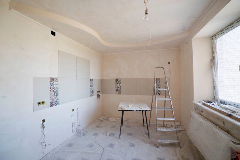
A renovation photo has a built-in advantage over most advertising: it shows evidence. The problem is that evidence is not automatically an ad. A beautiful kitchen can still disappear in a crowded feed if the image is too wide, the result is unclear, or the caption asks people to “get in touch” without giving them a reason.
For construction professionals and DIYers, the strongest social media ad usually comes from a simple sequence: show the work, explain the change, and make the next step obvious. You do not need a studio, a drone, or a large design department. You need a useful photo set, a narrow promise, and a version of the creative built for the screen where people will see it.

Start with the story behind the photograph
Before opening a design tool, write one sentence that answers: what changed, for whom, and why does it matter? “We renovated a kitchen” is a subject. “We turned a dark, awkward kitchen into a brighter cooking and gathering space” is an advertising angle.
That distinction matters because a renovation is full of possible stories:
- Problem to solution: poor storage became a more usable layout.
- Craft detail: joinery, tile alignment, trim, lighting, or surface preparation.
- Transformation: an unfinished or dated room became a finished living space.
- Process and trust: planning, protection, cleanup, or attention to detail.
- DIY learning: a technique, mistake, tool choice, or decision that helped the project succeed.
Pick one. A single ad that tries to tell all five stories usually tells none of them clearly. My preference is to lead with the homeowner’s visible problem, then use the craftsmanship as proof. People may admire a perfect corner, but they inquire because they recognize a problem they want solved.
Build a small photo library, not one “hero” shot
The finished-room photograph is valuable, but it should not have to do every job. A useful renovation ad set contains different kinds of evidence:
- Context: the room before work or the site during construction.
- Action: someone measuring, installing, testing, sanding, or reviewing the plan.
- Detail: a close view of a finish, junction, fixture, texture, or storage solution.
- Result: the completed space photographed in clean, natural light.

Process photos are especially useful for contractors because they answer an unspoken question: “Will this person take my project seriously?” For DIYers, they make the ad more relatable. A clean result is aspirational; a real work-in-progress can make the project feel achievable.
When taking new photos, shoot more than one orientation. Capture a vertical frame for Stories and Reels, a square or near-square frame for feeds and carousels, and a wider frame if you may reuse the image on a website or in a display campaign. Do not assume a platform’s automatic crop will preserve the feature you care about.
Compose for the crop before you add text
Social platforms do not display every creative in the same shape. Meta’s current guidance recommends 9:16 for Stories and Reels, while 1:1 and 4:5 are common feed formats. Its best practices guide for ad aspect ratios is worth checking before exporting a final asset.
Use the crop to increase emphasis, not merely to make the file fit:
- Place the strongest visual feature near the centre, where automatic crops are more likely to retain it.
- Leave breathing room around important edges, especially faces, fixtures, and fine finish work.
- For a vertical ad, step back far enough to show the room’s depth instead of cutting off the feature that explains the transformation.
- Take a second, tighter version for detail-led ads. A wide room shot and a close-up should not be forced into the same composition.
Meta also warns that interface elements can cover parts of Stories and Reels creatives. Keep logos, headlines, and calls to action away from the top and bottom edges. The exact display can vary, so preview the ad on a phone before spending money.
Let the image prove; let the copy explain
Heavy text over a renovation photo is tempting because it feels like you are making the message impossible to miss. In practice, it often makes the image harder to read. Google’s guidance for responsive display ads recommends high-quality images, avoiding overlaid text and buttons, and keeping the service itself as the focus. That is sensible advice for social creative too, even when a platform permits text overlays.
Try this division of labour:
- Photo: show the finished space or the most persuasive detail.
- Primary copy: name the problem and the improvement.
- Headline: state the service or result in a few direct words.
- Call to action: ask for one next step, such as “Request a walkthrough” or “Save this layout idea.”
For example, instead of placing “KITCHEN RENOVATION” across the centre of the image, use the photo cleanly and write: “A darker, cramped kitchen became a brighter everyday space with better storage. Planning a renovation? Send us a photo of the room.” The copy gives the viewer a reason to act without covering the work.
If you need a fast way to assemble variations, an advertisement maker can help you test different crops, headlines, and calls to action while keeping the underlying photo consistent. Treat the tool as a production aid, not a substitute for choosing a clear message.
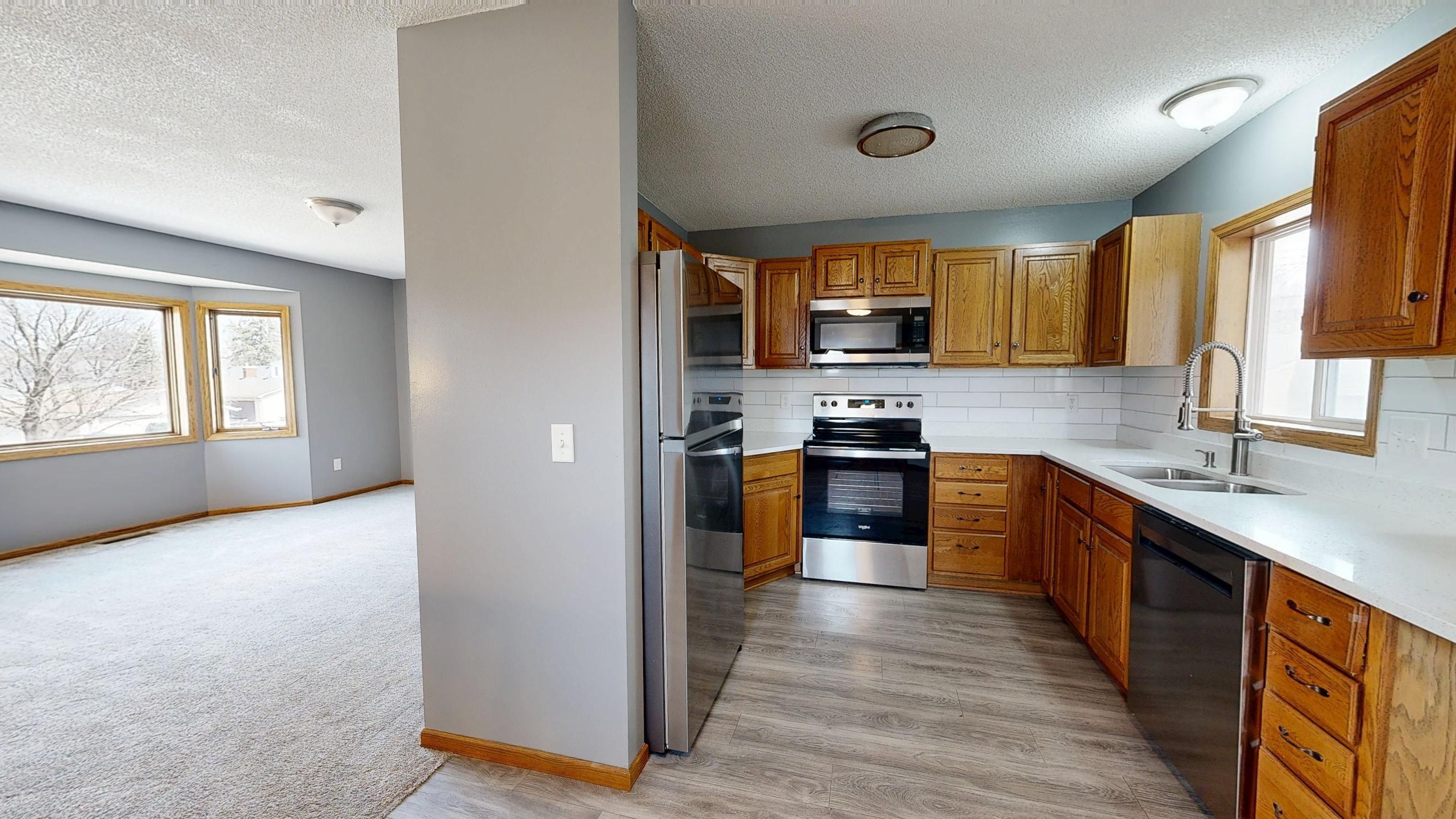
Turn four photos into four different ads
Do not make four near-identical versions and call that testing. Give each image a distinct job:
| Creative | Best job | Example message |
|---|---|---|
| Finished room | Attract attention and establish the result | “A brighter kitchen designed for everyday life.” |
| Work in progress | Build trust in the process | “Good renovations start with careful planning.” |
| Detail shot | Demonstrate craft or a material choice | “The small finish that makes the whole wall feel intentional.” |
| Phone or social preview | Invite engagement or show the project story | “Save this before-and-after idea for your next renovation.” |
The point is not to predict a winner from the desk. It is to create meaningful alternatives so the result teaches you something. If the process image attracts more qualified messages than the polished room, your audience may be buying confidence in the builder as much as the finished look.

Write a scroll-stopping hook without sounding like a gimmick
A hook is not a dramatic promise. It is the first useful idea the viewer encounters. Construction and renovation audiences respond better to specificity than to exaggerated claims such as “You won’t believe this transformation.”
Use one of these starting points:
- Reveal: “This unused corner is now the most practical part of the kitchen.”
- Problem: “If your kitchen feels dark even during the day, start with the layout.”
- Decision: “The finish was chosen for fingerprints, light, and daily wear, not just the showroom.”
- Invitation: “Send a photo of your room and we’ll help you identify the first design decision.”
Keep the promise honest. Do not claim a project was “completed in a weekend,” “budget-friendly,” or “maintenance-free” unless you can substantiate it for that specific work. Trust is a conversion asset in construction; a clever line that creates the wrong expectation is expensive.
Use a simple production workflow
Here is a repeatable workflow for a contractor, small remodeling business, or DIY creator:
- Sort: create folders for before, process, detail, and after photos.
- Choose: select one audience and one problem for the ad.
- Crop: prepare a vertical version and a feed version without cutting away the proof.
- Write: create one short primary message, one headline, and one clear CTA.
- Design: add only the branding and text needed to identify the offer.
- Preview: inspect the creative on a phone with brightness reduced and sound off if it is a video.
- Check the destination: make sure the landing page, contact form, phone number, or direct-message instruction matches the ad.
- Compare: change one meaningful variable at a time, such as the opening photo or the promise.
Google’s responsive display guidance also recommends creating several ads with different messages and images rather than relying on one asset. The same principle works for social campaigns: a small, deliberate set of variations beats a single “perfect” design that never gets challenged.
The renovation ad checklist
Before publishing, ask:
- Can someone tell what changed within a second or two?
- Does the photo show real work rather than a generic aspirational room?
- Is the important subject safe from platform controls and cropping?
- Does the first line explain a problem, result, or useful idea?
- Is there one clear action instead of several competing requests?
- Does the destination deliver exactly what the ad promises?
- Have you checked permissions for people, homes, client interiors, music, and branded materials shown in the creative?
The best renovation ad is rarely the one with the most decoration. It is the one where the viewer immediately understands the change, believes the evidence, and knows what to do next. Your phone already has the raw material. The craft is in selecting the right moment, protecting the image from the crop, and making the promise precise enough to trust.
How this guide was put together
This guide combines practical creative direction with platform documentation checked on October 9, 2026. I consulted Meta’s published guidance on aspect ratios and safe areas, plus Google Ads’ current responsive display recommendations on image quality, overlays, asset variety, and landing-page consistency. Platform interfaces and specifications change, so preview the final creative in the ad manager you plan to use before launch. No performance percentage or guaranteed result is implied here; the right message, audience, offer, and destination still determine whether a renovation ad earns a useful response.